What do barkadas (a group of close friends) talk about after 38 years? Catching up on general things, their kids, and mostly endless reminiscing of high school antics, fun, and happy moments. It is just sad that we often reconnect with our oldest and dearest friends when something tragic has happened. In our case, Elizabeth lost her father and I just got released that day from a two-day quarantine (COVID-19 pandemic). That short call to pass my condolences bridged the years as if we just graduated from high school.
The client: Chef Chryso and Dale Morales, and Matthew Ignacio, but they were not aware that their mother Elizabeth (Liza Hernandez-Morales as she is known in the food and hospitality industry in Manila) and I conspired in “meddling” with their branding.
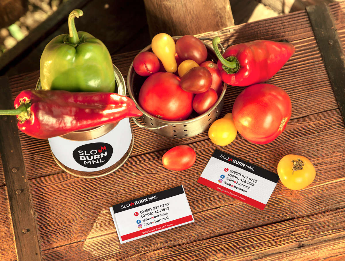
The challenge: To create a logo that will reflect the product of the business and match the personas of the three creative and hardworking young gentlemen that are behind Slow Burn MNL.
The result: The Wordmark logo describes the brand Slow Burn MNL. The Gotham geometric sans serif font conveys simplicity and minimalism which depicts the creative 3 signature selections on their menu. The “W” fire evokes energy, passion, drive, motivation, and creativity that perfectly fits the brand.
The black color in the logo makes a powerful statement and conveys professionalism, seriousness, and respectability. The red color is a universal symbol of passion, excitement, and youth.
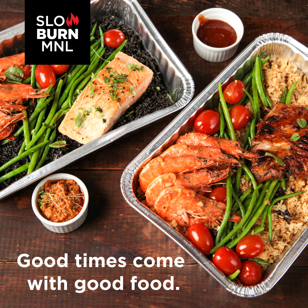
The business: Chryso is the chef and co-owner of Slow Burn Mnl, a family-oriented home-based food business — run professionally — that’s born out of the pandemic. It specializes in fall-off-the-bone smokin’ ribs with just the right char and caramelization. Chef Chryso’s method of choice is live coals, but he uses coco coals because they’re more environment-friendly. (https://philstarlife.com/living/266148-slow-burn-mnl?page=2)